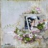
A very warm welcome friends. I’m back again with you today with my last Papericious post before Christmas. As the year is winding down my workload has seemed to have doubled. But my love for what I do is still the same as when I started out 11 years ago. I still love to share all that I learn from my mistakes and the challenges I sometimes face. So today I would love to share with you my friends a layout, not a Christmas layout, but a beach layout!!
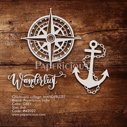
I also included some of the beautiful Wanderlust Collage Chippis.
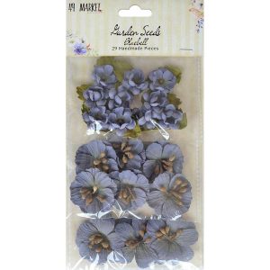
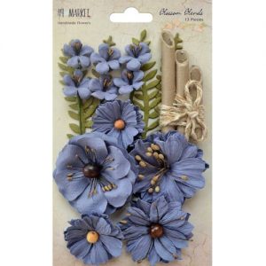
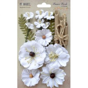
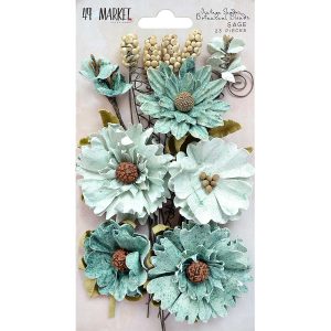
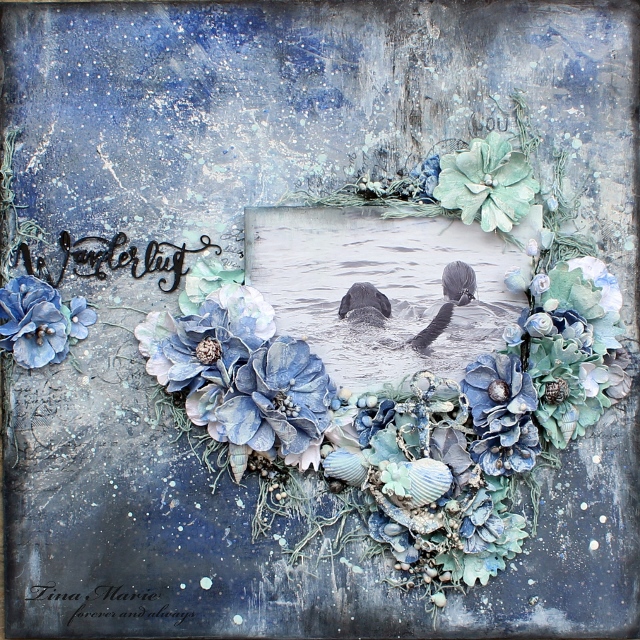
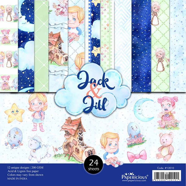
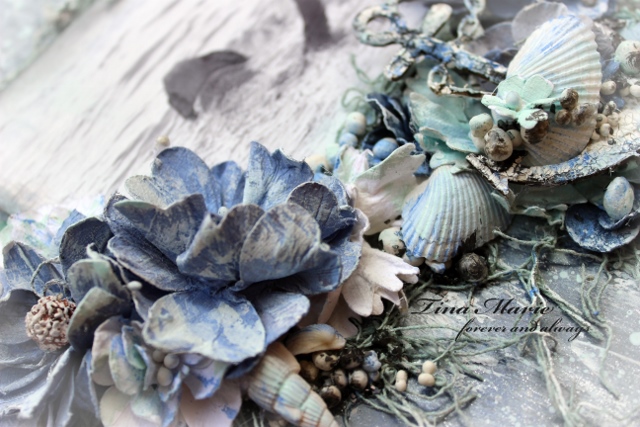
Once I came across the blue piece in the Jack and Jill collection I just knew that it would become a beach project combined with the Wanderlust Chippis. A great combination to start with. I did a lot of background mixed media work on the paper using clear gesso and Papericious Chalk Paint in Natural White. I have also used Distress Inks ombined with the Natural White chalk paint to colour my flowers. Adding a drop of the ink into the Natural white instantly gave me the colours I was looking for. Perfect for changing up the flowers from 49andMarket that I have used here.
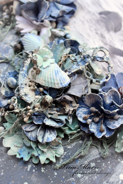
I also coloured some netting that I had in my collection. This was where I started layering and embellishing my layout. I used a 4 x 6 landscape photo, sanded the edges and also gave the edges some colour using the mixed colours and then mounted it on 3D foam tape to give my layout more dimension.
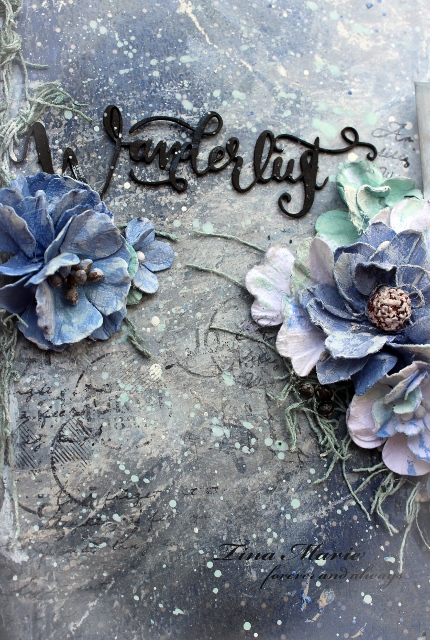
The font for the Wanderlust title from the Chippi Collage set is just stunning. I love it!! This was simply inked in Black Soot Distress Ink. In the photo above you can see the random stamping that I did also.
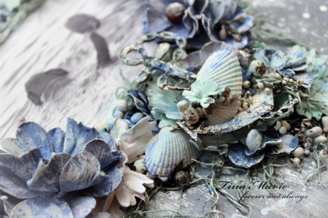
Vintage Shades Botanical Blends Sage
Well that is all from me today. I hope you enjoyed your visit!
Teen x
